SKY BREAK is a hotel inside the airport — a smart pause for travelers in motion. We crafted a bold, human brand that cuts through terminal noise with clarity, comfort, and a touch of wit. From logo to signage, every detail was designed for visibility, speed, and warmth.
The Pause That Was Missing
The Problem
Inside airports, most travelers just want clarity and rest — but hotel brands often speak like they’re selling luxury, not solving fatigue.
The Solution
We built a brand that’s fast, warm, and easy to spot — made for humans in transit, not tourists on vacation. It says just enough, exactly when needed.
Built to Be Seen
SKY BREAK’s identity is made to cut through terminal noise. The logo, color palette, and type system are all built for speed, legibility, and warmth — helping travelers spot us, trust us, and feel at ease in just one glance.
Logo
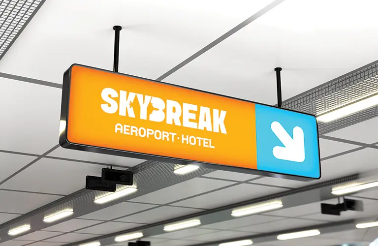
Clear in Every Hall
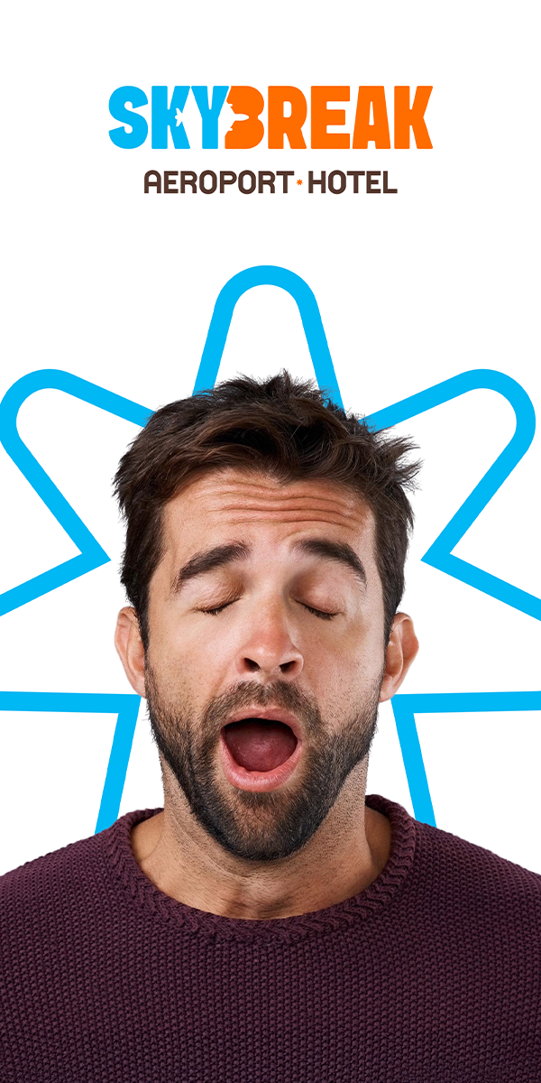
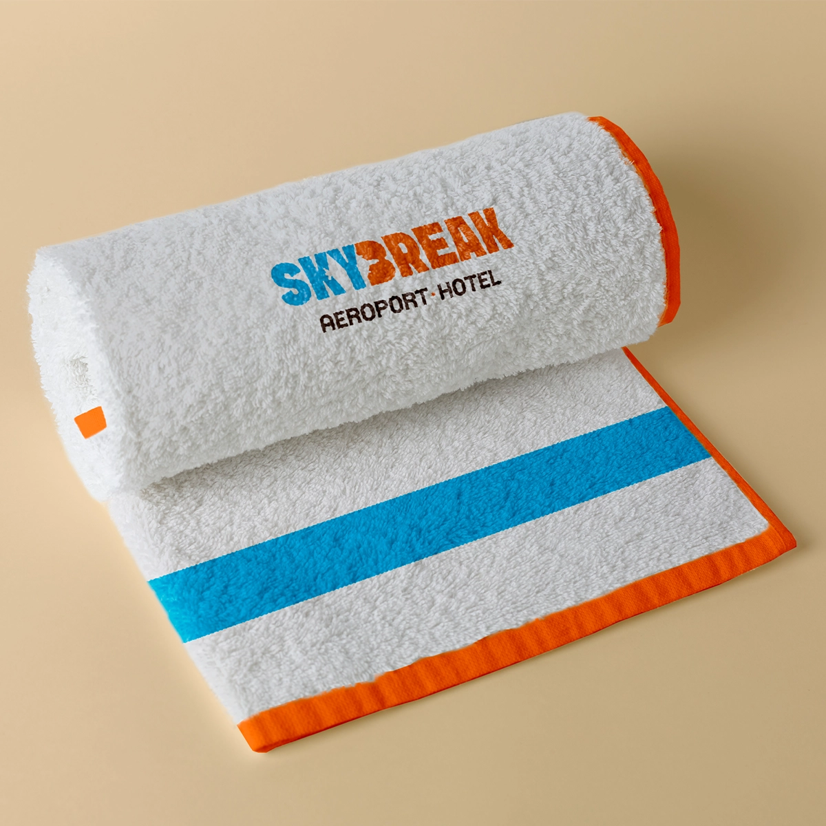
The logo balances bold visibility with calm clarity. “SKY” in blue, “BREAK” in orange — a dual rhythm of rest and energy. The airplane cut through the name says it all: this hotel isn’t near the airport. It’s in it.
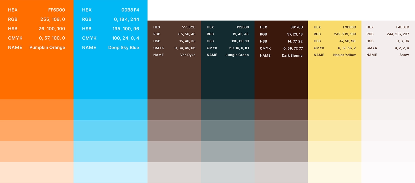
Color
Designed to Pop
The palette is made for airport visibility: bold blue for clarity, bright orange for warmth and urgency, deep brown for grounding. These tones work across signage, screens, and check-in counters — hard to miss, easy to trust.
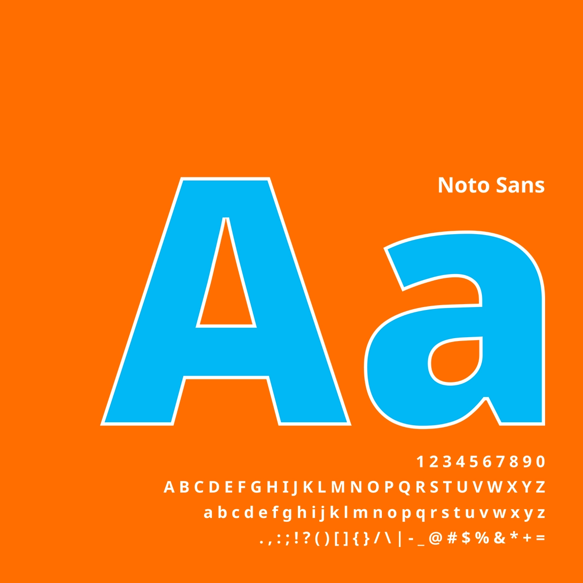
Typography
Effortless to Read
We chose Noto Sans for one reason: clarity. It reads fast, works in any language, and feels neutral but warm. It’s used in check-in screens, signage, and mobile confirmations — a typeface built to move, just like our guests.
Built to Be Understood
SKY BREAK shows up through more than just design — it speaks clearly, feels human, and guides people fast. From tone of voice to facial photography to directional signage, every element helps tired travelers feel seen, safe, and at ease.
Brand Voice
Clear, Kind, and a Bit Clever
The voice is human, direct, and warm — just like a good front desk agent. No jargon, no fluff. Just what travelers need: a bit of clarity, a touch of wit, and the feeling that someone thought this through.
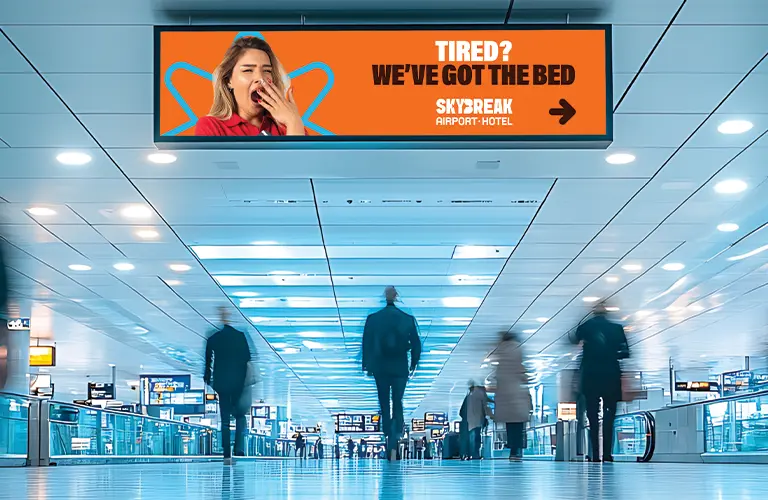
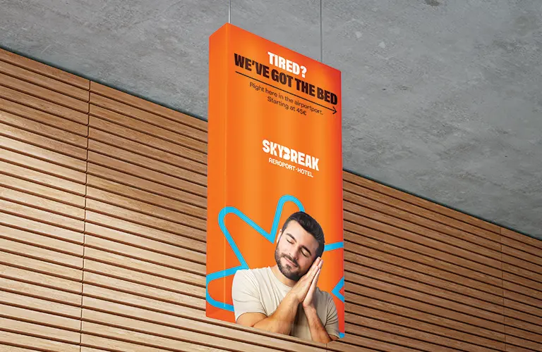
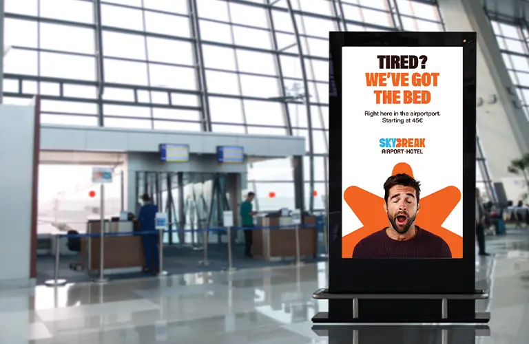
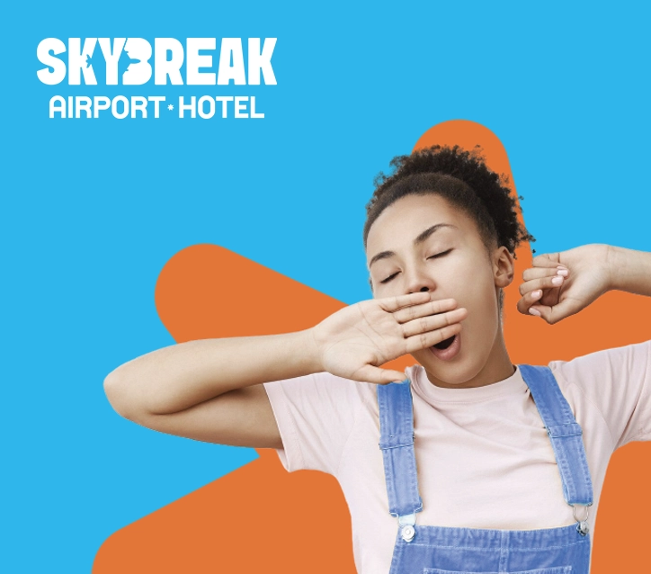
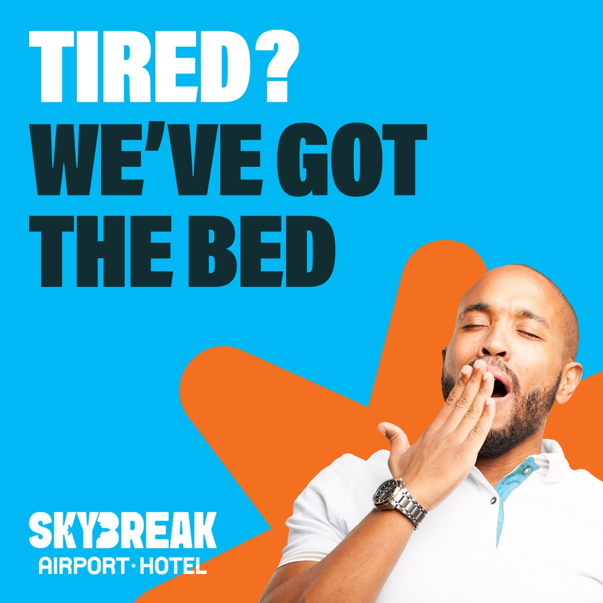
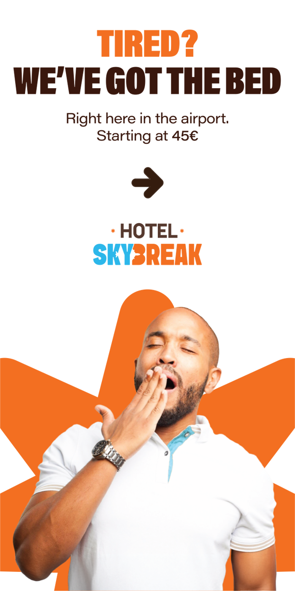
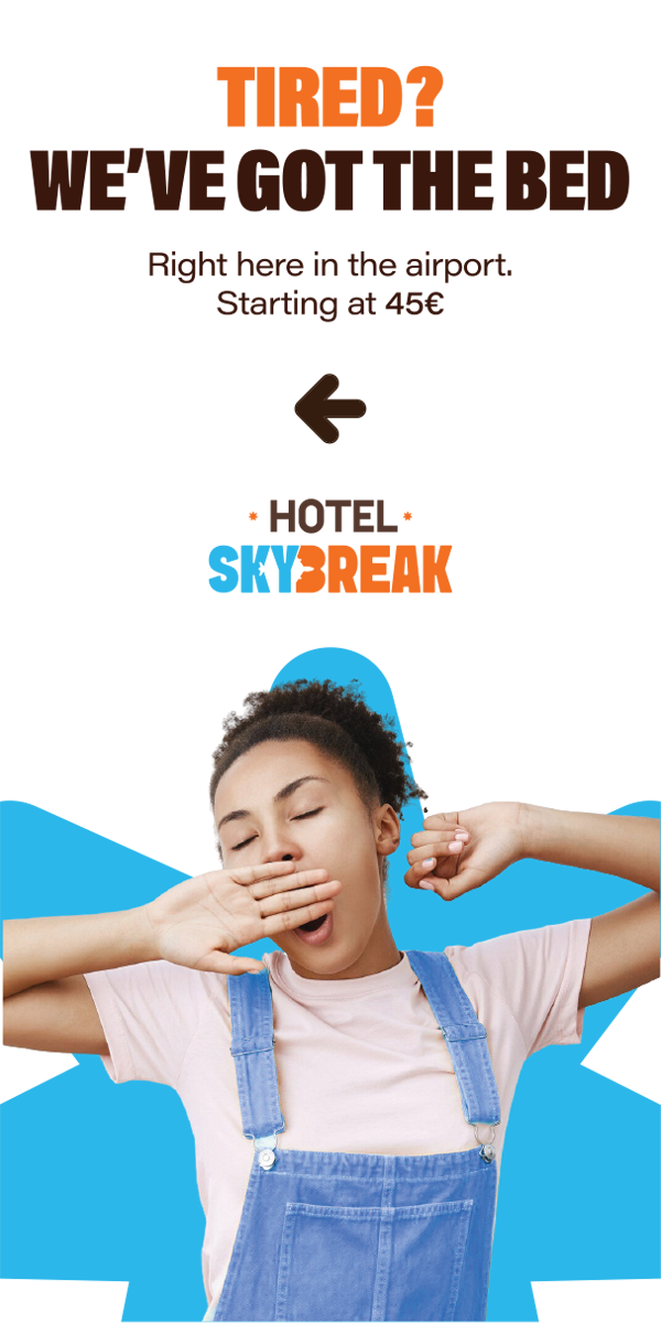
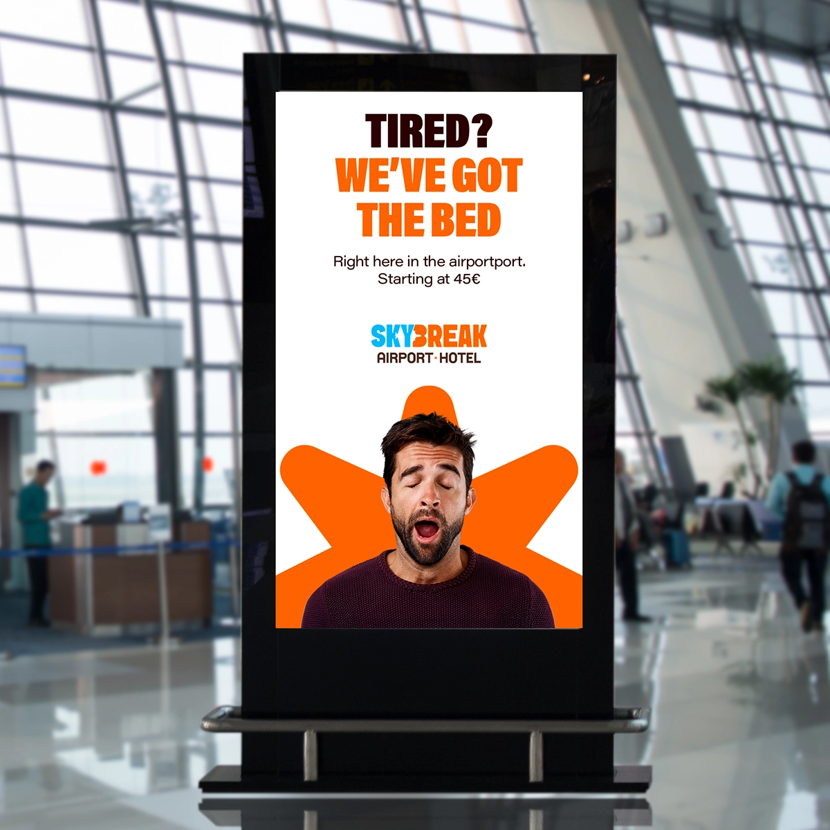
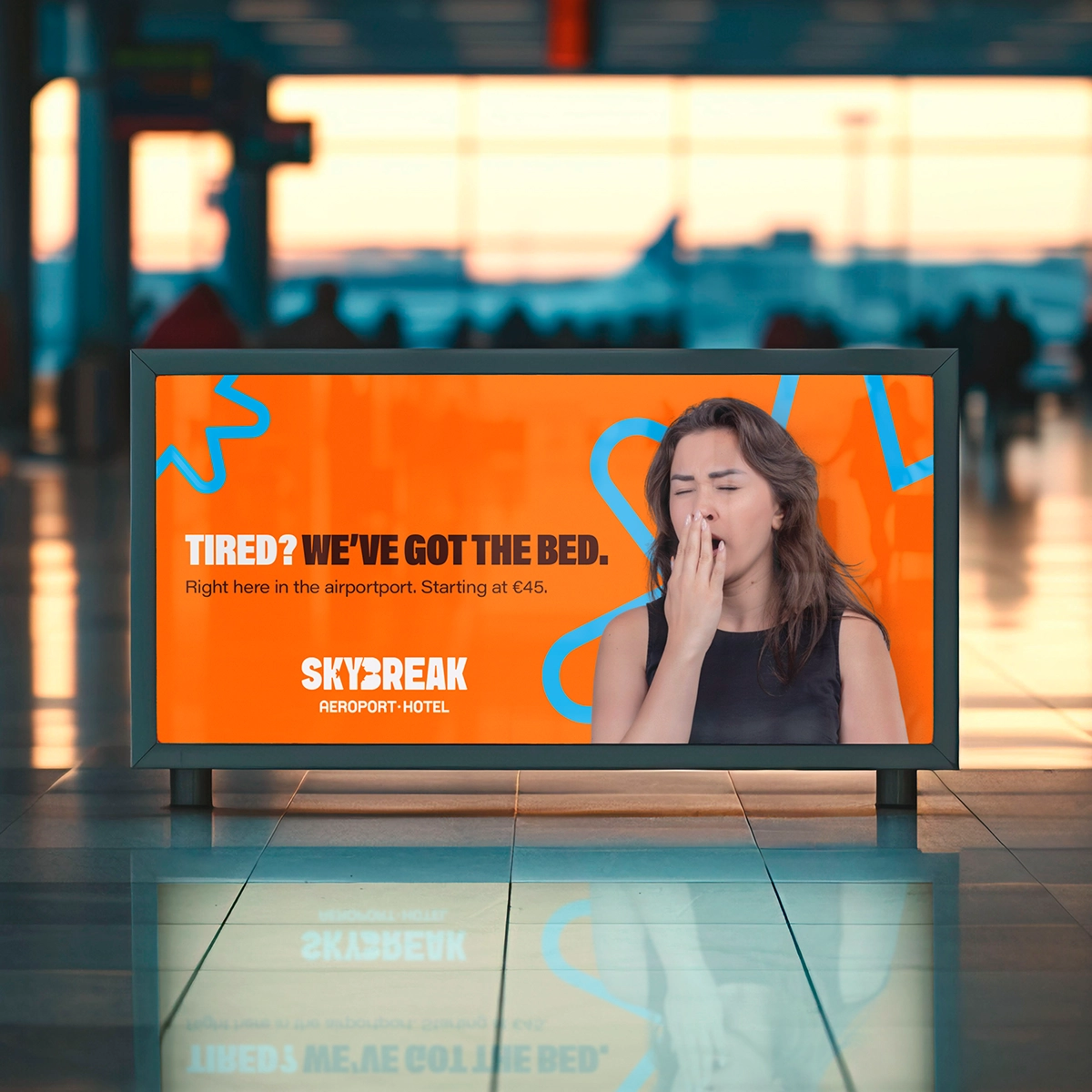
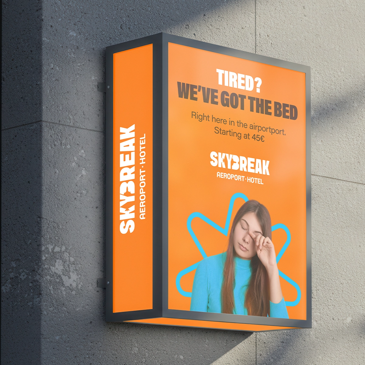
Photography
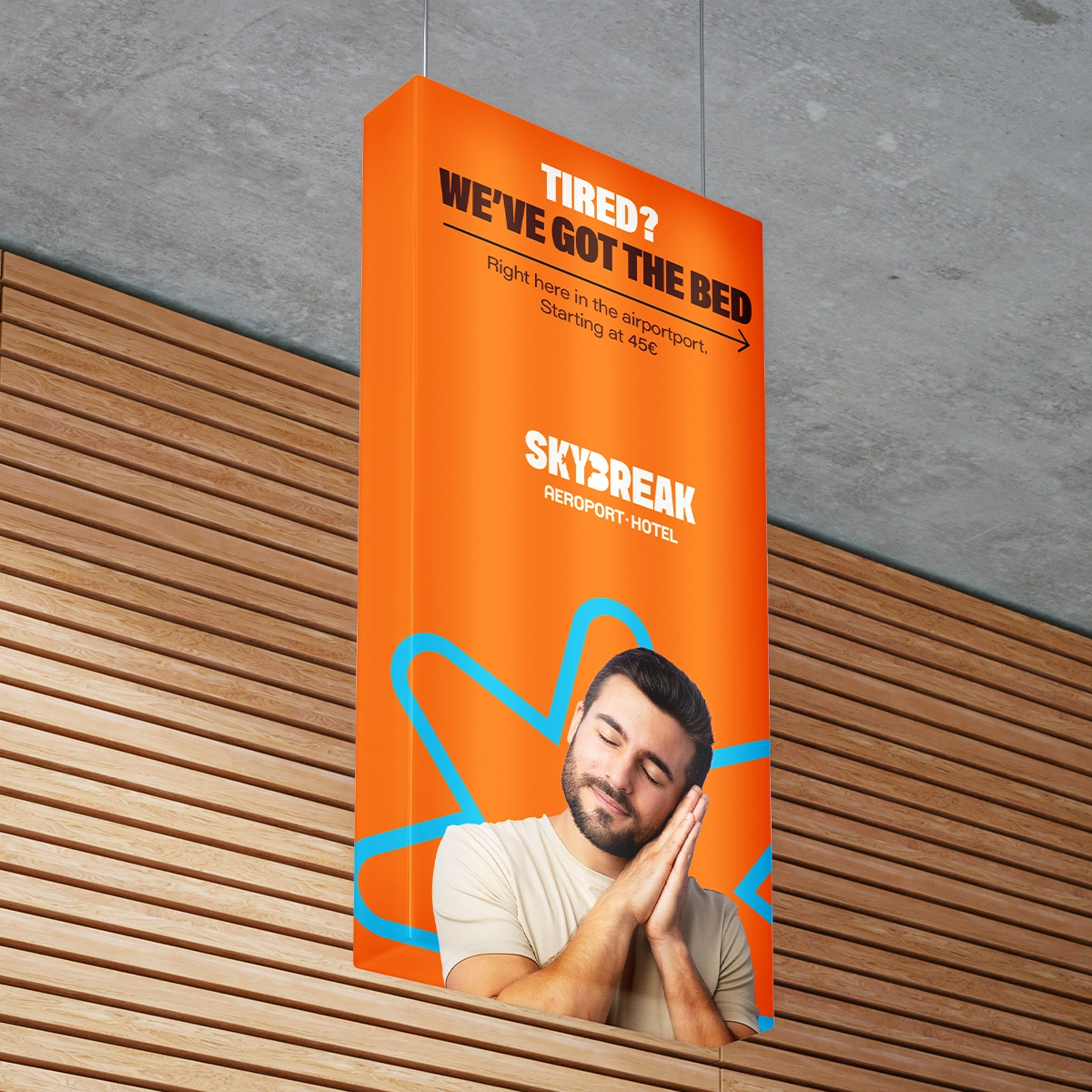
Show the Need, Not the Room
We focus on faces, not furniture. Mid-yawn, eyes half-closed, head in hand — our images are real, relatable, and instantly recognizable to anyone who’s had a long layover. No posed models. Just truth.
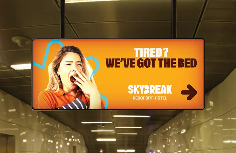
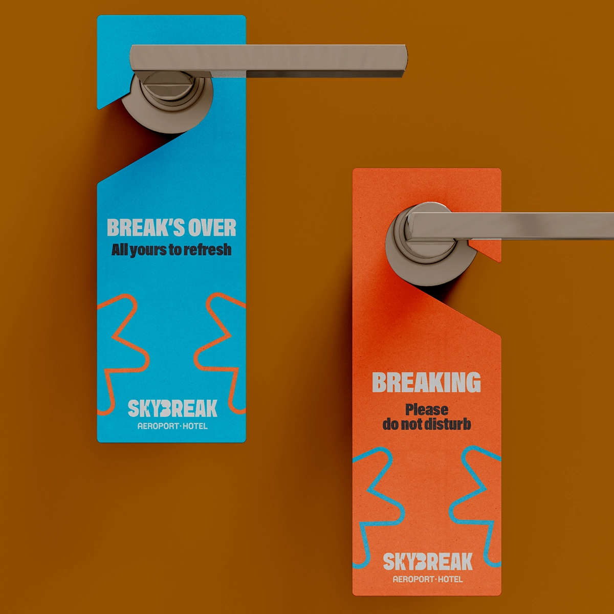
Signage & Applications
Designed to Guide
From terminal screens to keycards and corridor signs, every application of the brand was designed for legibility, speed, and calm. Travelers shouldn’t have to think. They should just know where to go.
More Stories. More Design
From national campaigns to grassroots innovations, UNIKNAS brings bold ideas to life across branding, UI/UX, and event design. Here’s what’s next.