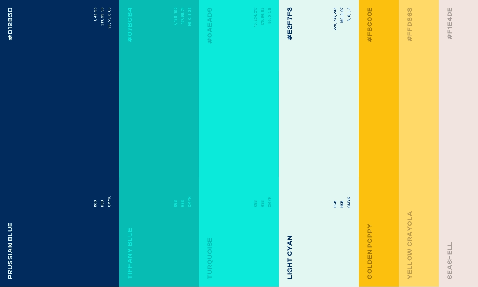
Latrach Dental Center
Latrach Dental Center is a family-owned clinic where dentistry runs deep — and so does design. We created a brand identity that reflects their legacy, values, and personal story — including a logo built from the initials of the founder’s children, most of whom are also dentists.


Designing Their Legacy
The Problem
The Latrach family needed a brand that reflected both medical professionalism and emotional connection — something personal, not clinical.
The Solution
We designed an identity system rooted in the family’s story: a clean, modern brand built around initials, legacy, and care — for all ages.
CHALLENGE
We created a visual identity that feels both precise and personal — blending modern dental aesthetics with a story of family, care, and continuity. Every detail, from logo to color, reflects Latrach’s deep-rooted values.
Logo
The icon is built from the initials of the founder’s children — most of whom are now dentists. The form is elegant and geometric, expressing structure and care. It’s a monogram, but also a symbol of legacy passed from one generation to the next.
Color Palette
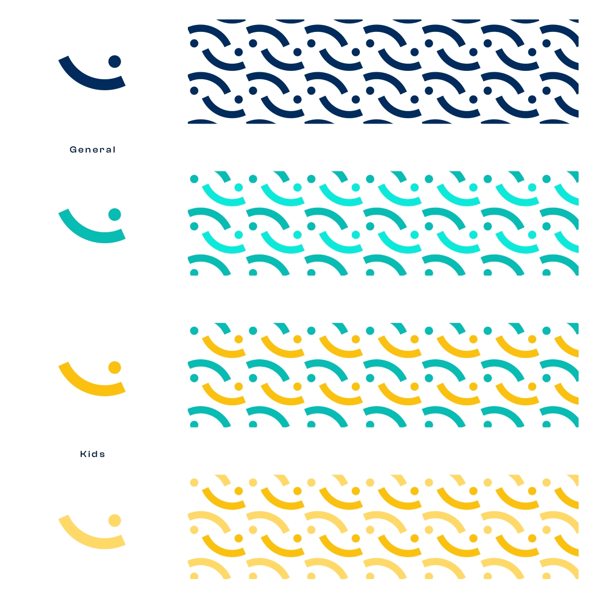
We developed two palettes: one for the general brand — featuring deep Prussian Blue, soft Tiffany, and elegant Sea Shell; and one for the kids’ brand — adding playful pops of Golden Poppy and Crayola Yellow to stay warm and friendly without losing clarity.
Typography
We used GoBold Uplow as a core typeface — modern, rounded, and easy to read across all mediums. Paired with soft Arabic typography, the system supports bilingual communication while staying approachable and professional.


Brand in Practice


More Stories. More Design
From national campaigns to grassroots innovations, UNIKNAS brings bold ideas to life across branding, UI/UX, and event design. Here’s what’s next.